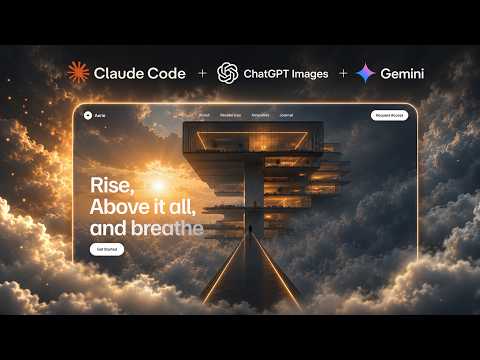
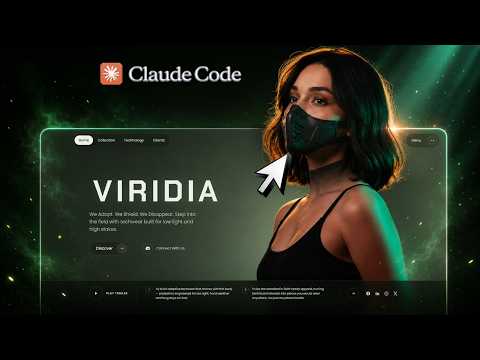
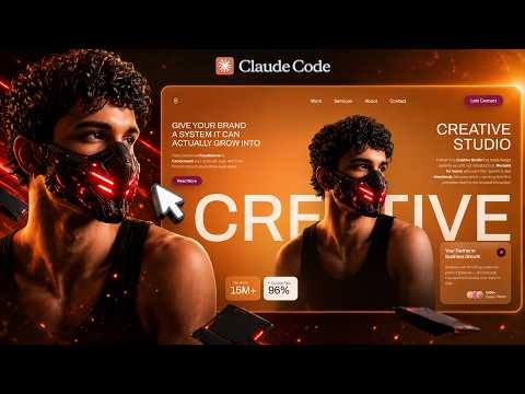
Most people meet AI website builders the same way: they type "build me a landing page for my agency", get something grey and centred, and conclude the tools aren't there yet. The tools are fine. The prompt is the problem.
A one-line brief gives the model nothing to be specific about, so it returns the statistical average of every landing page it has ever seen. A prompt that names the layout zones, the type scale, the motion curve and the scroll behaviour gives it something to build. That is the entire difference, and it is why this lesson is two minutes long rather than twenty.
This is the shortest workflow on the channel and the one to start with. Nothing here requires design skill, and the only thing you type is your own copy.
01Why AI-built sites usually look like AI-built sites
The tell is never the code — it is the sameness. Centred headline, three feature cards, a gradient, a screenshot. Every model produces it because every model was trained on it, and a vague prompt asks for exactly that average.
Specificity is what breaks the average. A prompt that says which element enters first, how far it travels, and what the scroll does to the background is describing one site rather than all of them.
From the library
Get the prompt for this build
The designs used in this lesson live in the library. Open one to copy the prompt behind it.
02Pick a design, not a description
Open the library and browse by the kind of product you are building for rather than by colour. Each design is a hero built for a specific vertical — analytics, security, studios, AI tooling — and the prompt behind it carries that intent.
Choosing the design first is the step that saves the most time. You are picking an outcome you have already seen working, instead of describing one you are hoping for.
- Match the vertical before the palette — the motion is tuned to the pitch
- Open a design to preview it full-size before committing to its prompt
03Copy the full prompt
Open the design and copy the prompt attached to it. It is long on purpose: layout zones, typography scale, colour values, animation timings, responsive behaviour and the dependency list are all in there, because every one of those is a decision the model would otherwise make for you.
Do not trim it. The instinct to shorten a long prompt is the instinct that produces the grey centred page.
04Paste it into your AI editor
Any agentic editor works — the video uses Lovable, and Claude Code, Cursor and v0 all take the same input. Start a fresh project, paste the prompt as the first message, and let it run to completion without interrupting.
Interrupting is the second most common mistake. These prompts build in a sequence, and a follow-up sent mid-build makes the model re-plan around a half-finished file.
- Start a new, empty project rather than pasting into an existing one
- Send the prompt as a single message, not split across several
- Let the build finish before you ask for anything
05Check it, then change one thing at a time
When the build finishes you get the typography, the animations and the scroll effects together, live in the browser with a shareable link. Check the things that actually break first: does the motion run smoothly, do the fonts load, does the mobile layout hold.
Then refine in small, specific instructions. "Reduce the headline size by about 15%" lands reliably. "Make it feel more premium" does not — it asks the model to redesign the page, and you lose everything that was already right.
- Test every breakpoint, even though the prompt covers them
- One instruction per message
- Describe the change, not the feeling
What you end up with
A complete animated site — typography, scroll effects, responsive layout — from one paste, in about the time it takes to read this page.
The workflow is worth internalising because it is the base every other lesson builds on: choose a design, copy its prompt, paste it, refine in small steps. Everything else on this page is a variation on that loop with more interesting assets in the middle.